
Book interior page design, book cover design, image guidance and proofreading
The Brief
I often have the pleasure of working with printers (and I’m married to a press machine minder!)
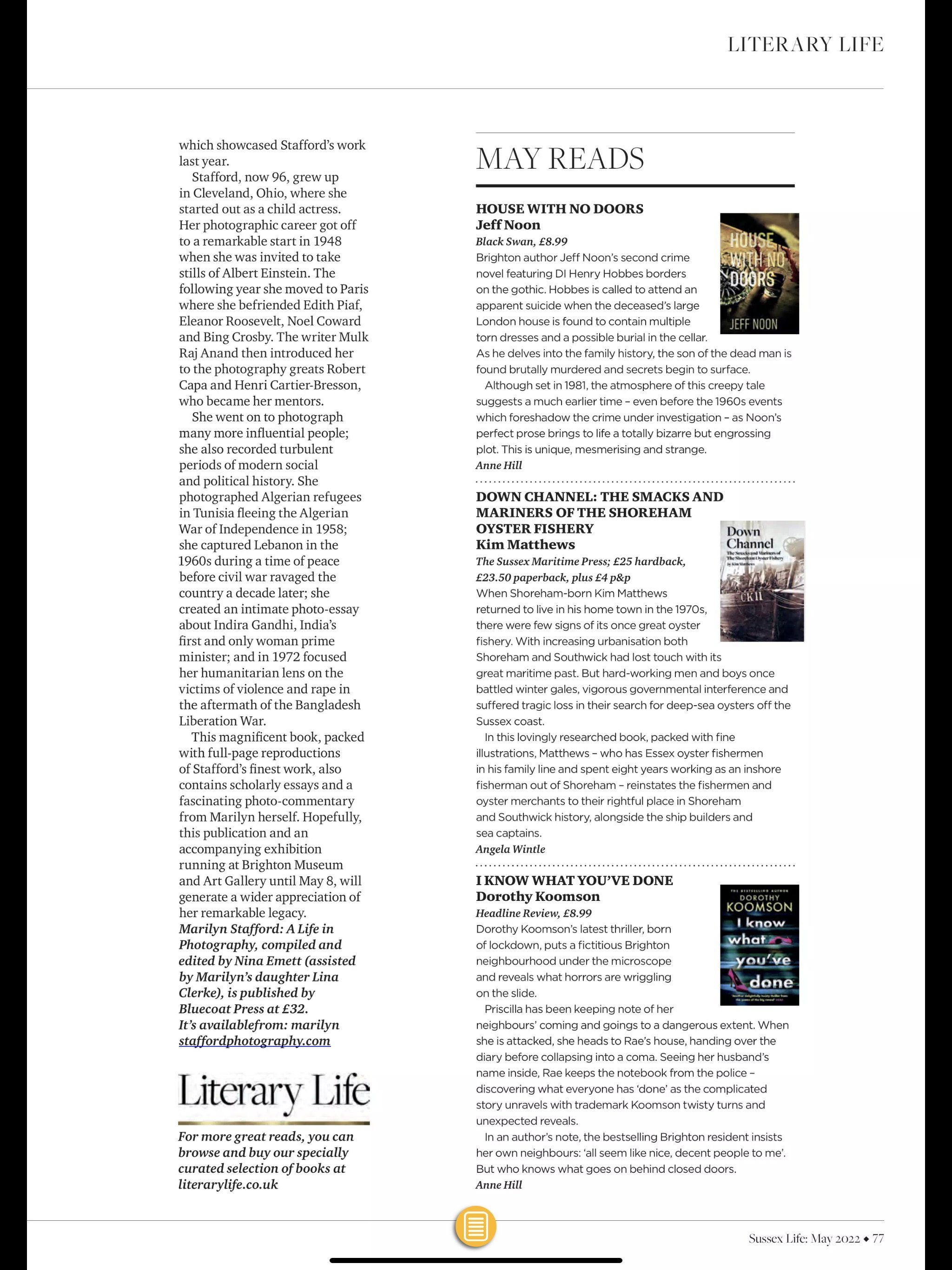
Gill Robinson runs Nexus CPP which supports authors and businesses with print management. One of her clients is author Kim Matthews who required a professional level book design. Down Channel follows the first-class oyster smacks from Essex, Jersey and Sussex as they battle winter gales, vigorous governmental interference and suffer tragic loss in their search for deep-sea oysters. The book features images and maps, with extensive end-notes.
What Hello Lovely did
Kim is a retired teacher and he explains the history of the oyster smacks with clarity and focus. Each chapter benefiting from gorgeous archive photography. The purpose of the design is to be invisible. Yes, that’s correct, invisible! If a book is well designed, it allows the content to take centre stage and guides the reader through the pages. Next time you read a book, do you really pay attention to the running heads, page numbers and how they look beyond using them to guide you?
Using sample text, I created three sample designs for Kim to view. After selecting one of these, I designed the book using the final text and images. I wished I had recorded a video of this as it demonstrated just why Adobe Indesign is so essential to book design. I use Affinity, a rival software, but Indesign is still way ahead with it’s ability to tune up the design under my customisation (and that’s important, knowing how to get the best from the software).
As with any historical publication, there can be problems with images from archives. Getting copyright clearance was essential on this publication and checking each image for resolution. The design also made allowance for this as often there isn’t any choice on alternative images that are better quality. Allowing thumbnail sizes in the margins or rejecting if they really are poor is a risk in historical publications.
The design also included the prelims and end matter. Prelims comprise a title page, imprint which lists legal information on the book, contents (if non-fiction) and introductory text. Endmatter is the glossary, end-notes if not used in the text and index.
Gill and I also proofread the files as we spotted a few inconsistencies in the manuscript. I took in all the corrections to the text and created PDF files for approval. Once approved the file was sent to press in two forms, one for hard back and a second for a soft back edition.
I also created the cover. Kim had suggested one image but the resolution wasn’t good enough to be stretched to a full page. Other options presented themselves in the photo archive that had been supplied for the inside pages, and I worked with a selection of these and Kim was delighted with the final image. I love it, as it tells a story of the people and the boats. Using Photoshop with some discrete editing, the sepia tones and textures were highlighted.
Software: Indesign, Illustrator and Photoshop
The Result
Kim’s book went to press successfully and he has been featured in the local media and ran a book launch too. I didn’t have any direct contact with Kim but enjoyed the collaboration with Gill who is very experienced in her craft and this was essential to the success of Down Channel.